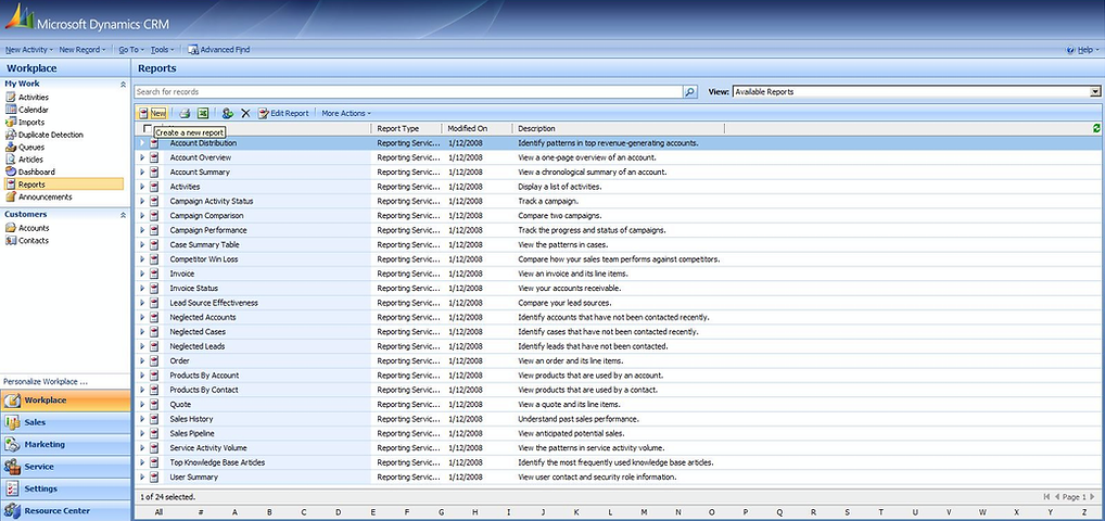
Anyway, as we were learning the intricacies of this system, some of our “fresher” Dynamics 365 consultants who have never seen this ancient system commented on how similar the UI is to the new Unified Interface. At first I didn’t see it – I worked with CRM 4.0 for years and couldn’t see past the non-customisable blue theme.

The sidebar
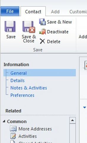
In the Classic UI many users have grown accustomed to navigating the system from the top:

As part of the Unified Interface the navigation moved to the side. Initially we had a set of icons \ shortcuts which were always visible, and we could get the full site map with a single click.


CRM 4.0 Navigation

Dynamics 365 Navigation
Form Tabs
The other feature that made a comeback is the Tabs. From CRM 1.2 all the way to 4.0 we had tabs on record forms:


Various customizations were created to try and change this and go back to CRM 4.0 style tabs.
And now, with the Unified Interface, tabs are finally back:

Conclusion
I’m not sure if we really have a conclusion from this. Perhaps that User Interface is created based on current design patterns and “fashion”? Maybe that the CRM 4.0 UI was actually good? Or maybe best practices come and go in waves, like many other things, and simple make a comeback every decade or two.
I think the lesson is that sometimes we make changes just for the sake of change, without thinking are we making it better or worse – we just want something different. Sometimes you need to lose simple navigation just to appreciate it more when you get it back.

